My Color-Blocking Trick That Stops Outfits From Looking Too Busy
There was a morning not too long ago when I stood in front of my mirror wearing an outfit that felt like a chaotic love letter to every color in my closet: bright teal pants I adored, a coral top that made me feel alive, a patterned jacket that absolutely refused to be quiet.
I remember staring at my reflection with this mixture of affection and confusion, because even though I genuinely loved every item I was wearing, the entire outfit felt noisy in a way that didn’t match the calm, artistic energy I wanted to carry into the world that day.
Instead of changing everything completely, I sat on the edge of my bed and began doing what I always do when color feels overwhelming.
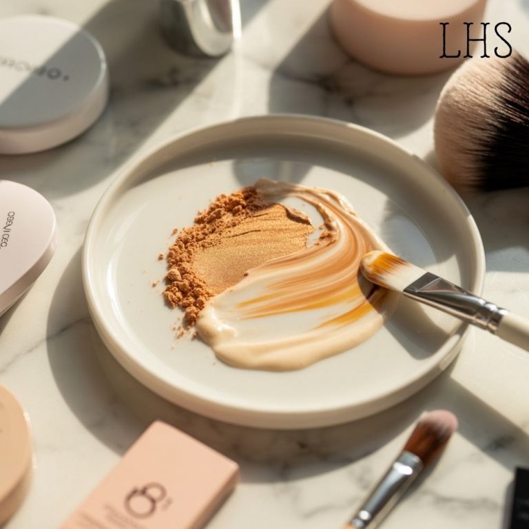
I let my eyes wander across the outfit like they would over a canvas, noticing which hues clashed, which ones clung to each other too tightly, which tones wanted more space, and which pieces desperately needed a moment of silence.
That was when the idea clicked. It was the moment I realized that the secret to making bold outfits look effortless instead of overwhelming is to give the colors room to breathe by grouping them into blocks that make emotional and visual sense.
Why Color-Blocking Is About Organizing It
There is something beautifully misunderstood about color-blocking. People think it means limiting yourself to safe combinations or keeping your outfit simple, but the truth is that color-blocking is more about thoughtful placement than restriction.
When I talk about color-blocking, I’m not talking about corporate-approved outfits with navy skirts and white blouses; I’m talking about creating sections of color the way an artist uses broad brushstrokes to create harmony in a painting.
Colors become overwhelming when they compete instead of collaborate. Color-blocking is simply the act of assigning each shade a moment of its own, a space where it can shine without fighting for attention.
And when you do it in an intuitive, expressive way, something magical happens: the outfit becomes bold without being chaotic, rich without being loud, and creative without looking disorganized. It becomes wearable art.
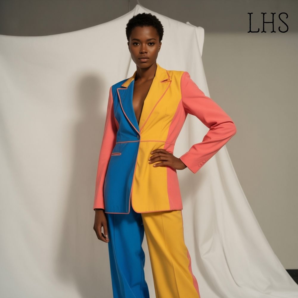
The Trick That Changed Everything: Choose One ‘Hero Color’ and Two ‘Supporting Blocks’
My entire philosophy can be broken down into one simple, flexible, playful approach: choose the shade that carries the emotional tone of your outfit and then choose two supporting blocks that exist only to complement or soften that hero shade.
The hero color is the shade that makes your heart beat a little faster when you put it on. It might be a fiery red, a juicy tangerine, a deep forest green, a hot pink that demands attention, or even a pastel lavender that glows softly under natural light. This hero color becomes the anchor, the emotional center, the voice of your outfit.
Once the hero color is chosen, the supporting blocks act like background singers. These supporting tones can be neutrals, muted colors, or even different hues of the same shade, anything that provides structure, depth, and visual rest.
The magic lies in placement, not quantity. Even the brightest outfit can feel calm when the colors are grouped purposefully.
How I Build the Blocks
Step One: I Start With the Piece I Love Most
It could be a skirt in a rich fuchsia or a top that reminds me of watercolor sunsets or a pair of pants in a bold cobalt blue that makes me feel alive. Whatever piece draws me in emotionally becomes the hero color.
Step Two: I Choose a Block That Grounds the Look
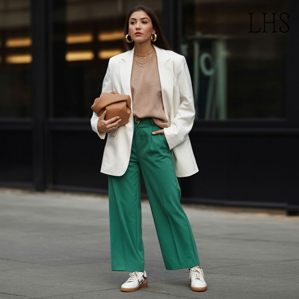
This block just needs to give the hero shade room to shine. This could mean pairing hot pink with soft camel, teal with crisp white, mustard with warm caramel, or ruby red with deep plum. These grounding shades act like negative space in art, providing balance.
Step Three: I Add the Third Block With Intention
This is where the personality comes in. The third block can be playful, subtle, or unexpected, but it must echo either the temperature or the undertone of the hero color. This echo creates harmony even when the shades are bold.
Step Four: I Use Accessories as Adjustments
If the outfit still feels busy, I adjust with accessories, treating them like tiny brushstrokes. A neutral belt can break a loud palette into sections. Soft gold earrings can warm up a cool-toned look. A monochromatic bag can unify the entire outfit.
Accessories are color punctuation guiding the eye through the look.
Examples of Color-Blocking That Feel Bold but Not Overwhelming
1. Fuchsia Hero + Camel Block + Soft Rose Accent
This combination feels warm, romantic, and richly expressive while still grounded.
2. Teal Hero + Ivory Block + Forest Green Accent
A palette that feels calm, botanical, and beautifully cohesive, inspired by nature.
3. Tangerine Hero + Cream Block + Brown Sugar Accent
Warm, sweet, sunny, and surprisingly wearable.
4. Cobalt Hero + Navy Block + Powder Blue Accent
A monochromatic story that feels artistic yet organized.
5. Plum Hero + Charcoal Block + Wine Accent
Moody, elegant, dramatic, and wonderfully sophisticated.
Each combination uses color-blocking not to simplify the outfit but to guide the eye smoothly from one shade to the next.
Let Your Colors Speak Clearly, Boldly, and Beautifully
If you’ve ever looked at a vibrant outfit and felt overwhelmed by the noise of competing colors, try giving your shades structure, purpose, and space by choosing a hero tone and supporting it with two thoughtful blocks.
Let your palette breathe. Let your shades collaborate instead of clash. Let your outfit become an arrangement of hues that reflect your personality rather than fight for attention.
When you color-block with intention, your clothing stops feeling like a loud argument and starts feeling like a beautiful conversation.